|
Design Tutorial Series: Part 5
 Once you have decided on your site structure, genre, colors and sitemap, it is time to choose your web site layout. There are a variety of ways to physically create your layout, from coding the html yourself to using an html editor software program that codes the html for you. No matter how you decide to code your layout, the actual design of the layout needs to be determined. The best way to get an idea of the type of layout you wish for your site is to a) look at quality sites for an idea of how sites can be successfully laid out, and b) to take out a pen and paper and physically sketch the layout you are envisioning.
The most common ways to lay out a site for uniformity, aesthetics, and sheer symmetry include the use of a) frames b) invisible tables and c) cascading style sheets. Frames, though still used by some web designers are considered passe, and are generally discouraged. Cascading style sheets are a wonderful new way to code a site's layout separately in a special file, then plugging in the content within various other files. But, for your first site, I recommend working with invisible tables to provide a framework for your content while keeping the table hidden from your site visitors.
The first thing to consider is the dimensions of your layout. Unfortunately, people use different monitor display resolutions to view the web. A small percentage of people still use a resolution of 640 pixels wide, which means your site would have to be very tiny to be completely visible on their screens. The common default width of most people's monitors is 800 pixels, which is still quite small. 800 pixels is currently the standard smallest size of screen resolution to create a website. Thus, it is recommended that your site should look good at an 800 pixel wide by 600 pixel height so that these viewers do not need to scroll to the right to view part of your site. More and more, people use a resolution of 1024 pixels wide or more. You will want your site to look good to these viewers as well. One useful action to take to do this is to define your layout tables in percentages so that they will accommodate any width. For instance if a table is laid out at 100 % width, it will fit 100% of an 800 pixel wide screen just as well as a 1024 pixel wide one. It is also a good idea to center the main table so that it falls nicely in the middle of the screen, no matter what resolution is being used to view your site.
The second step is to choose the table configuration that you will use to create your layout. Below, you will find four common, quite easy to create table templates that can get you started in the right direction. Details for four layout table templates are discussed below - click on the link for each to download a pdf file of each template, complete with an image of the table being created as well as the basic html code for creating each one.
LAYOUT TEMPLATE ONE
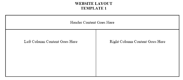
As you can see from the diagram, template 1 consists of three main "cells" made up of one long Header row at the top, with two equal size larger content columns below. This design is excellent for a site that requires frequent side images, supplemented with text content. The top header part can contain the title of the site as well as the navigation titles or buttons.
Click Here to download a copy of Template 1 and the html code to create it.
LAYOUT TEMPLATE TWO
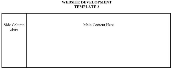
Template 2 is a much simpler design with only two "cells" including a thin side column and a much larger main content column. This design is simple yet effective for a site that houses large amounts of text and/or graphics. The side column is perfect for your navigation text links or buttons, while the main column can house your content.
Click Here to download a copy of Template 2 and the html code to create it.
LAYOUT TEMPLATE THREE
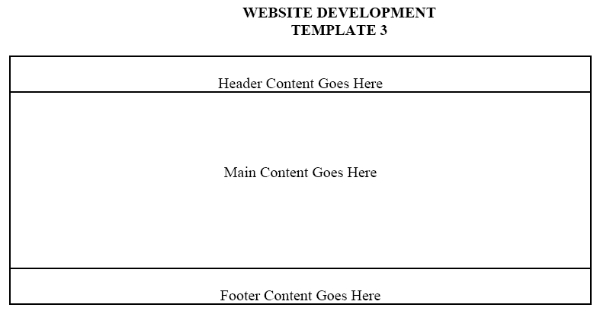
Template 3 is also a very simple yet tidy design with three identical "cells" made up of three uniform rows stacked on top of each other. When you first create the template, all three rows will look equal in width and height, but as you add your main content to the center row, the middle cell will become much larger than the smaller top and bottom rows. This design is quite elegant when your content is arranged with a header at the top, and your site information in the footer. You can put your navigation links or buttons either in the top or bottom rows (some people put it in both places, especially if the page scrolls down for a screen or two.)
Click Here to download a copy of Template 3 and the html code to create it.
LAYOUT TEMPLATE FOUR
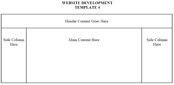
Template 4 is one of the most common layouts on the Internet. It consists of one long header row, with a second row beneath which is divided into three columns. The left side column is usually used for navigation titles or buttons, the right one for content highlights, announcements, ads, or small images, while the middle one is where the main content goes. The top row is usually used for headers, search boxes, small ads, and sometmes a second navigation access area.
Click Here to download a copy of Template 4 and the html code to create it.
Once you have your basic layout coded, you can move on to begin creating your navigation scheme, specifying your colors, and plugging in your content.
to page 3 |